
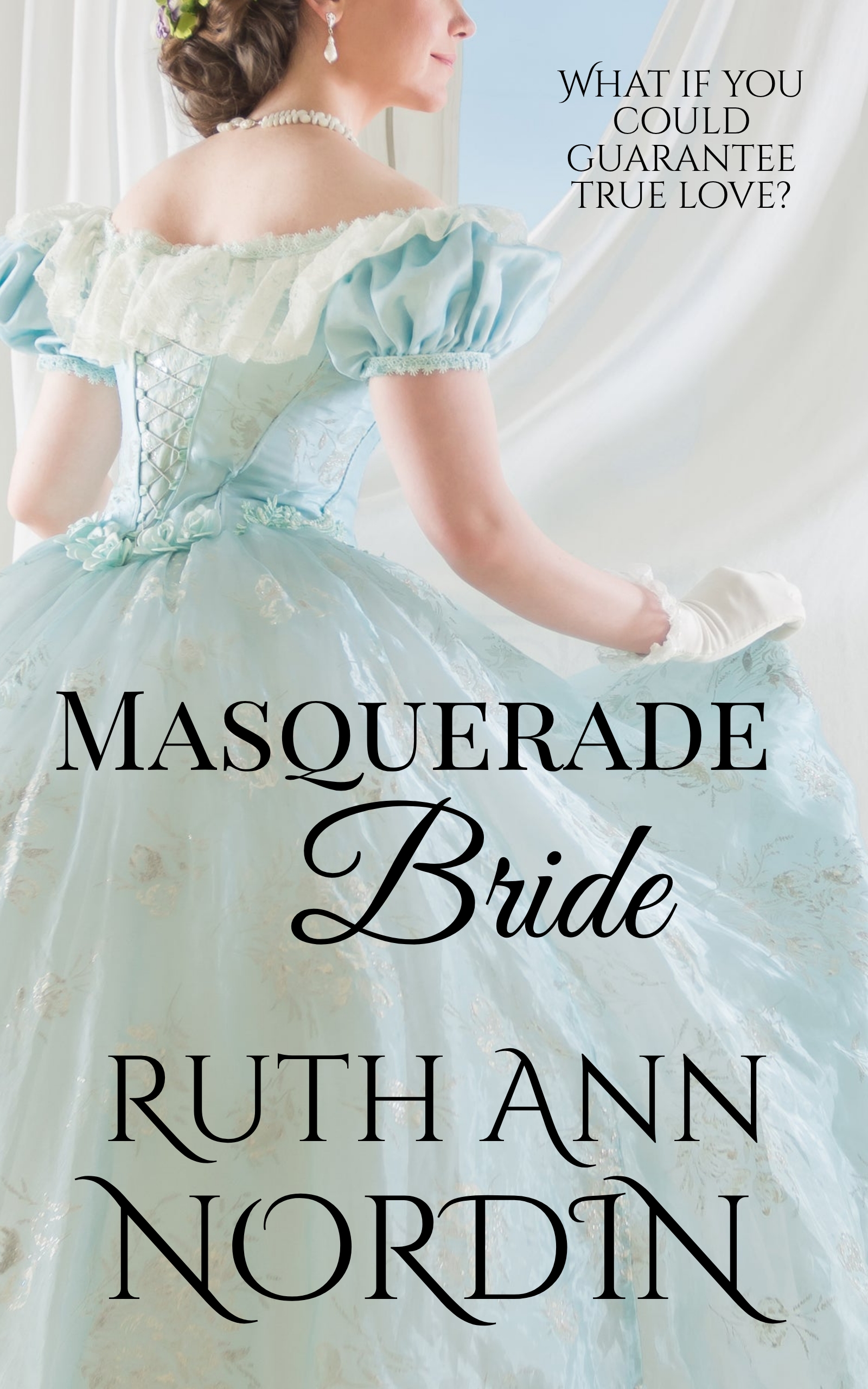
I’ve been doing a sample from one of my books on Sundays, but since the kids have been sick, I’ve been editing A Most Unsuitable Earl (and handing it off to my excellent team to polish up), and have been getting ready to paint/carpet the house, I figure I’d take the easy way out and post up my favorite book covers. I usually use GIMP for the ebook cover and BookCoverPro for the paperback.
Just to note: I have had some of my covers made by others. But I’m featuring the ones I made that I like the most, especially since I finally learned how to use more than one picture to make a cover. 😀 In my opinion, that was my biggest accomplishment this year.
These are my favorite paperback covers because I was able to put something on the back cover that enhanced the book (at least it enhanced the book for me). 😀

I really like seeing Carrie (the heroine) on the back of this cover. Sometimes I think of changing the front cover and putting her on it, now that I know how to put more than once picture onto a front cover. This was made before I knew how to do that.

Again, I like this cover a lot because Ted and Megan are on the back. I also like the front because it has the black and white bride and groom with the colored flowers. And I also like the color scheme. Peach and black worked well together.

Stephannie Beman designs covers for other authors in her spare time, and she gave me an idea of putting a full cover image on the back cover. The method involves less text on the back to make room for the cover, and depending on the picture, there should be some transparency. I thought it sounded neat and have been doing a couple of my latest paperbacks that way. Substitute Bride is one of them. I might end up making the back cover image more transparent if the text isn’t easy to read. I will need to see the paperback proof from CreateSpace to see how it looks.
 Okay. I used more text on the back of this cover than I probably should have (will see how it looks when I get the paperback proof), but I figured it had enough white space to work with more text. What I like most about it is that you get to see Catherine (and how she looks on the back is pretty much how she is in the book with red being another hint to her personality), but mostly, I love the color red. I don’t know if anyone noticed how much red I tend to use, but it’s one of my favorite colors to put on a book cover.
***
Tomorrow, I’ll post my favorite ebook covers.

very nice! 🙂
Thanks, Jo!
Great covers!
Thanks!