
Congratulations to Lorna Faith and Crystal Young who won a copy of Janet Syas Nitsick’s new historical romance, Lockets and Lanterns, and either a copy of Eye of the Beholder or Shotgun Groom (by me). Please go to Janet Syas Nitsick’s post for more information. 😀
As for the covers, I have two new ideas. I’ll add the original cover here as well. Anyone have any thoughts on one that looks better than the other? I can’t show Mary’s face because she’s plain, and though I hate to say it, plain heroines don’t appeal to people who are browsing books. So I had to make it so that you couldn’t tell the models I used were attractive. That’s not to say that Mary is ugly, but being plain, she just wouldn’t catch someone’s eye.
Cover 1

Cover 2

Cover 3

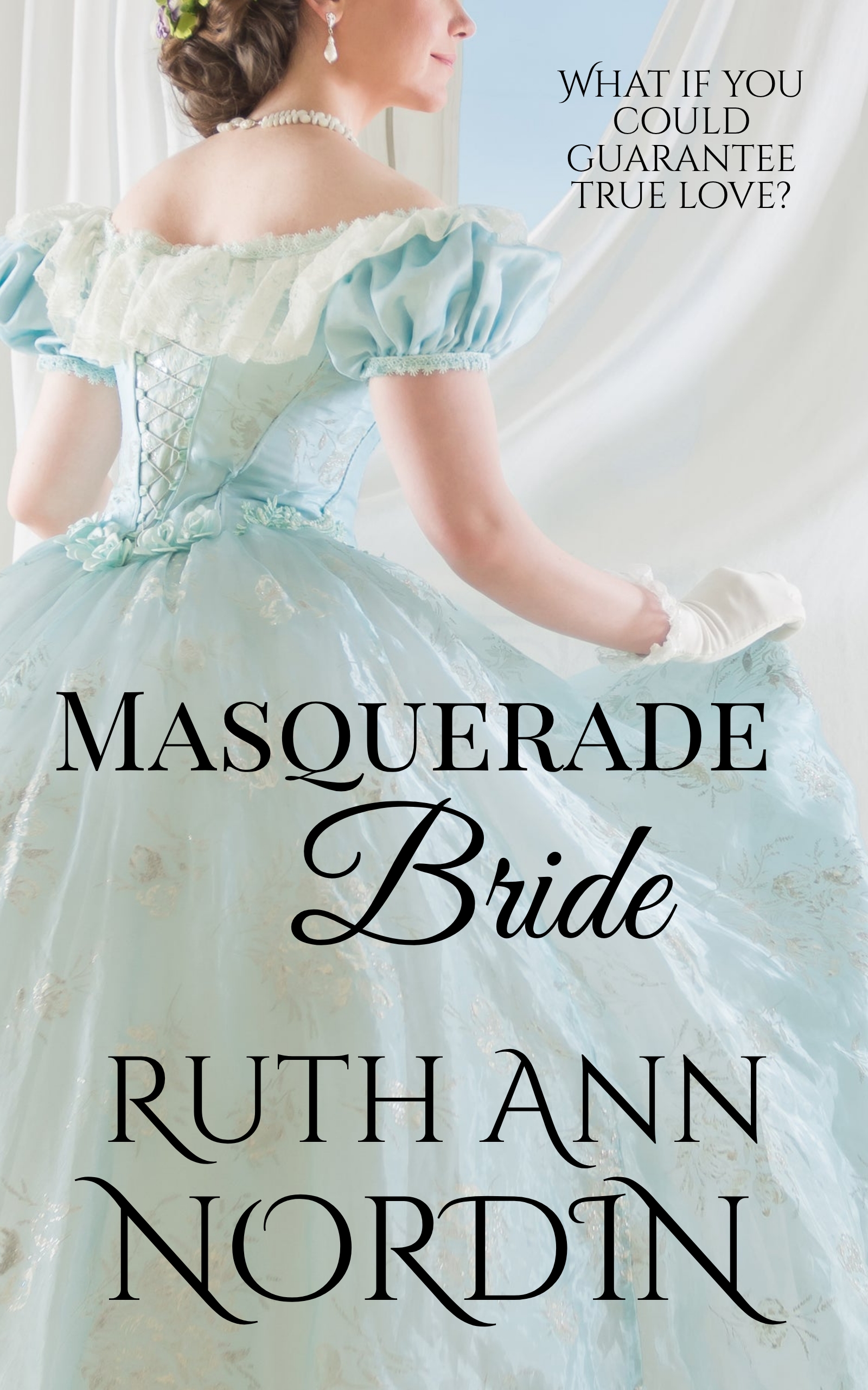

I think that I like cover 1 the best. I think it’s the dress and I like the lettering as well.
It looks like most people prefer the first cover. 😀 If her hair wasn’t on her face, I would have showed part of her face in that picture. But since the model’s hair was in her face, it looked almost like Cousin It from the Adam’s Family. LOL
Congratulations to the winners.
I like the middle one best.
My next giveaway will be for the Native American Romance Series. Now that I finally finished the final book, I can give away the complete set. 😀
Everyone else seems to like the first one, so I’ll stay with that. However, I love the model and will use her again.
Since Mary has curly hair, only cover 1 would be true to character description. Also, the bold blue color of the dress catches the eye. On cover 2 and 3, the white title gets washed out. I’m so glad Dave and Mary get another book!
My fear was that showing so little of Mary on the cover would make it less attractive, but since you and most of the others like the first one best, I’ll stick with Cover 1. I’m happy to hear you’re looking forward to another Dave and Mary book. 😀 I wanted to do a romance where the couple is already married, and Dave and Mary are the ones that stuck out. I know I did the amnesia slant, but it was like starting over since she didn’t remember him.
I like the first one, mostly because I like that dress. 🙂
Thanks. Looks like Cover 1 will stay. I’m glad it worked out. I worried since I wasn’t showing any of her face that it wouldn’t work, so it’s nice to know it does work after all. 😀
I actually prefer no face to a face that’s partially cut off. My real preference is to show the whole person, but we’ve had this discussion with Jimmy Thomas, a cover model I use sometimes. He said the reason faces are cut off sometimes is that the focus is on the body. But there’s no way I’m cutting Jimmy’s face off…he’s too gorgeous. LOL
It’s weird how you can’t really show Mary’s face because she’s not attractive…but what you say about that is true. The girl on the cover of my latest WIP isn’t very pretty (though not ugly), but the pose was perfect. The first thing my husband said when he saw it was “Couldn’t you have found a prettier woman for the cover?” LOL
Okay, I’ve talked enough. 🙂
I keep meaning to answer your comment, and I lost it somewhere in my inbox where I flagged it to remember. Anyway, I’m finally getting around to it. 😀
I can understand why you don’t want to cut Jimmy Thomas’ head off. LOL I look forward to seeing the cover you’re talking about so I can see how the heroine’s face is positioned.
I like the first one the best too.. and am looking foward to another dave and mary book.. thanks i love the nebraska series
Looks like the first one gets it. 😀 I’m happy to hear you’re looking forward to a third Dave and Mary book. It’ll be fun to go back to them.